Let me just say, I love this condo!
But I didn't love this condo when I first met it .. don't get me wrong , it did have loads of potential and I'm super proud of my cousin for seeing that and grabbing it up right away. Not many people can see a finished product that is merely existing in their imagination, not to mention the imagination of a designer.
<< Here is the small inspiration board we made >>

As I walked through the 1980's condo, with its yellowed with age white walls and its stained carpet, I could see the potential she saw.
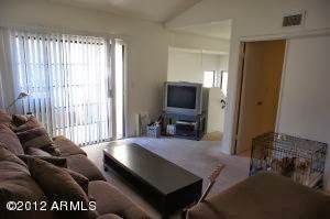


I wish I had some before photos of the bathrooms, but included one from a neighboring condo that hasn't been updated.. at least you'll get the idea.


.jpg)
So, we tore out the carpet and replaced it with an economical laminate. It has such a beautiful warm look to it and is durable enough to withstand heavy foot traffic .. which is an especially good idea in an area where student housing is it's main attraction. All of the products we used in this space were from Home Depot. They really have a good selection and are very good to their pro's.
Here is a look at what we did to the main living, dining and kitchen areas:
 |
| Great Room > After |
 |
| Dining Area > After |
 |
| Kitchen > After |
We painted the walls a minted variation of white. It wasn't a huge boost of color but it really gave a fresh look and feel to the space. The base boards were replaced with a 3 inch base that has small beveled detail, I call this "the cute base".. it's just simple .. but not standard. We picture framed each window and door in the condo, giving each opening as much character as possible. In the kitchen, we covered the countertops with a marble tile (a simple granite slab would have been great too), this tile was also used in the bathrooms, on the floor and tub/shower surrounds. The over head lighting was probably the biggest change in the kitchen, we removed the paneled lighting, picture framed the opening and added a pretty light fixture recessed in the space. All of the appliances were replaced, but these finds were the most economical and on budget.. in my opinion, they bring the kitchen together.
Here is an after shot of the ceilings, they now have a fresh smooth coat texture on them and painted with Behr Swiss Coffee Flat, it really lifts the ceilings, even in a tall space. Notice the fan has been removed and the nasty rough sawn beam has been wrapped and painted. Ahhh, much better.

I could go on and on.. but you get the picture!
<< Here's a look at the rest of the space >>
 |
| Master Bedroom |
 |
| Guest Bedroom > Looking in. |
 |
| Guest Bedroom > Looking out to the great room. |
 |
| Hall Bath |
 |
| New Master Side Bath |
 |
| Hall Bath |
What I wouldn't do to furnish this place.. if I could, I'd bring in my partner in crime Tina Tuttle of Wall Flower Diaries and we'd have a ball!
Check out our interior design site to see more of our collaborations >> Blueprints & Damask <<
No comments:
Post a Comment