Wednesday, March 12, 2014

The First of Many

The first of many Equestrian Country Homes is under way here in Tucson Arizona (actually in Marana & Picture Rocks).

Take a peek at the inspiration photo for the first home, there are many changes in the floor plan already.. but what do you expect from design builders? 

Dream Home Source >> See Pin Here

There isn’t anything revolutionary about the homes that we are rolling out in the Picture Rocks and surrounding areas. But, there is something to say about their charm and appeal.
The mass building era changed the way the Southwest looked at homes, in some ways this was good and in others, not so much. The quality of new homes plummeted while their sales prices continued to sky rocket. The problem? Value. We aren’t just talking resale value, although that is a huge reason for buying and putting equity in a home, we’re more focused on the actual value. What will this place look like in 5 years, 10 even? Will the roof hold up, will the quality of paint set a standard for the extreme weather that Tucson experiences? What is the cost to cool or to heat each home?
 A builder’s concern should be all of these things, because it’s their expertise. Standing by what you’ve built should be a standard. These homes aren’t high end, they aren’t custom, won’t be worth millions, but what they will do is hold their own. They’ll grow in value, and they’ll last for generations. Picture Rocks and the surrounding areas feel like small town America, the homes should be something to be proud of. Giving our neighbors a valuable buy isn’t just a quick need that is filled, they’ll now have an asset, that appreciates year by year rather than depreciating almost immediately. They’ll be able to get financing and refinancing when they need it. It’s the American Dream.

Wednesday, February 26, 2014

Girly Prints!

I just had to share these super cute hand drawn prints .. they will fit so perfectly in the space that I just finished!


>>>>>>>>>>>>>>>>>>>>>>>>>>>>>>>>>><<<<<<<<<<<<<<<<<<<<<<<<<<<<<<<<<<<<<<


Aren't they just so fun? 

See the room they were inspired by >> A Room For The Girls <<

Find your own inspiration and have custom prints made >> Josie Jo's Studios <<

Monday, February 24, 2014

A Room For The Girls

This was so fun! I got to design my little cousin's bedroom.. to S H A R E. Jessie (13) and Julia (9) decided that they could share a room so that their Mom would be able to convert one bedroom in to a home office (that one is next on our agenda). 

As it sat, Jessie's room was decorated years ago in a jungle theme.. at 13 years old and entering high school next year she decided it was time for an upgrade. Julia's room was still cotton candy pink with bunk beds and had a princess air about it. If you met either of them, you'd know.. they were both way past these themes. But hey, you've got to wait for your busy Mom to make something happen. 

Here are a few "before" photo's of the room we tore apart (Jessie's) .. it isn't a fair view because the bed was already taken out .. but good luck trying to slow these girls down when their new room is in the works. 


I asked each girl what they wanted and both were very adamant that there was to be  N O  P I N K  in the room, at all, whatsoever. I took it in stride and set out to find "the look". Julia wanted blue and Jessie was fixated on purple. I knew that keeping pink out of the room was going to be difficult, I just really love pink. But hey, this isn't my room. 

I consulted my parter in crime in Blueprints & Damask, Tina. We always throw ideas off of each other, even if we are working on personal projects. Our minds work well together. 

I told her what I was thinking and threw her some verbal elements that I wanted to see in the room, she did what she does best, put it to inspiration boards. This is a great tool that we actually offer clients to implement our designs themselves.. check out our joint >> blog << for more information. 

I knew right away what I wanted to do to the walls, the room is small but I could make it seem bigger with layout and paint. Yes, paint makes a big difference in how large your room is perceived. I chose "Manhattan Mist" as the wall color, the rest I'll go into in a minute. 

Here are the boards with our initial thoughts for the room and it's personality:

Jessie's Bed
Julia's Bed

As you can see.. there is pink in there, we just couldn't help it. But, it really was a great starting point. The girls loved them (minus the pink). 

This bedding was from Pottery Barn Teen and to be quite honest, I wanted to find something that could grow a few years with them and not be old news next year. Actually, that was the goal for the room. Make it cute, fun to be in and easily updated without going through this whole thing all over again in no time. The girls were excited because they got their colors. 

The first thing I did in the room was prime the walls and have my handy brother come in to shoot up some simple chair rail trim four feet up from the carpet. Above that I'd paint with the wall color and below I'd paint white, giving it the look of wainscot. Doing this would really lift the ceiling and give the walls a taller look. It's more work, but definitely worth it.


My Aunt wanted to up-cycle as many elements that we could that already existed in the room, I agreed .. why not save as much money as possible? We took the wooden bunk beds apart (my Uncle did) and painted them white, their brown desk was painted white on it's body and "Sea Mist" on it's top, the table lamp was also up-cycled, painted the same fresh colors and given a brand new (on sale) lamp shade. 

My Dad.. the master. 
We hunted for the perfect wall decor, pieces that were more grown up but still fun. Do you see that heart marquee above my Dad's head?? That was a pretty fun find. 

Each girl got a pin board hung above her bed, Julia needed her animal print which we found at Target and Jessie got a custom board made by my Aunt! It seriously is worthy of applause. We had such a hard time finding throw pillows that reflected the girls style and gave the beds the personality that we wanted.. so, I found the material and my Aunt made those as well! 

We had a blast and I'm happy to say, the girls love their room. That's all that matters! Here is the final product.. 


The fuzzy pillows were purchased as was a tiny little pillow (( that we had to have )) and ordered online .. we didn't realize it was the size of a cell phone .. oh well!! My Aunt made the chevron pillows and the Eiffel Tower pillow on Jessie's bed .. I am obsessed with them!! 


Aaaand here we are, happy girls in a happy room. They call it their dorm. 

Friday, February 14, 2014

Romance Me Baby

Perche, Paris - Île-de-France

Well, Tina did it again. She's so good at finding homes that are on the market abroad and stateside that could use our loving touch. When she sent Perche to me I said, “I get my stone cottage!”.. she spoils me. Rotten...


Read More >> http://blueprintsanddamask.blogspot.com/2014/02/perche.html?m=1

Thursday, February 13, 2014

An Arizona Hacienda

At first we looked at the space and what was in it and went Southwestern, a more modern and soft take on a Southwestern space... >> Read More <<

The space's inspirational elements.. >> See The final Mock Up <<

Monday, January 27, 2014

A Simple Facelift


Let me just say, I love this condo! 

But I didn't love this condo when I first met it .. don't get me wrong , it did have loads of potential and I'm super proud of my cousin for seeing that and grabbing it up right away. Not many people can see a finished product that is merely existing in their imagination, not to mention the imagination of a designer. 


<< Here is the small inspiration board we made >> 

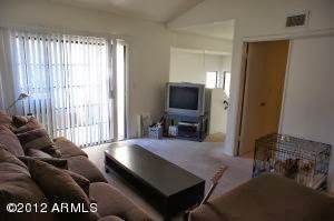
As I walked through the 1980's condo, with its yellowed with age white walls and its stained carpet, I could see the potential she saw. 


But first .. it was time for demo. We ripped everything out of this place, the flooring, the base boards, door trim, slab doors, tub, vanities, toilets and let's not forget the popcorn ceilings. They were scraped and retextured with a fresh smooth coat. 


I wish I had some before photos of the bathrooms, but included one from a neighboring condo that hasn't been updated.. at least you'll get the idea. 


So, we tore out the carpet and replaced it with an economical laminate. It has such a beautiful warm look to it and is durable enough to withstand heavy foot traffic .. which is an especially good idea in an area where student housing is it's main attraction.  All of the products we used in this space were from Home Depot. They really have a good selection and are very good to their pro's. 

Here is a look at what we did to the main living, dining and kitchen areas:

Great Room > After
Dining Area > After
Kitchen > After
We painted the walls a minted variation of white. It wasn't a huge boost of color but it really gave a fresh look and feel to the space. The base boards were replaced with a 3 inch base that has small beveled detail, I call this "the cute base".. it's just simple .. but not standard.  We picture framed each window and door in the condo, giving each opening as much character as possible. In the kitchen, we covered the countertops with a marble tile (a simple granite slab would have been great too), this tile was also used in the bathrooms, on the floor and tub/shower surrounds. The over head lighting was probably the biggest change in the kitchen, we removed the paneled lighting, picture framed the opening and added a pretty light fixture recessed in the space. All of the appliances were replaced, but these finds were the most economical and on budget.. in my opinion, they bring the kitchen together. 

Here is an after shot of the ceilings, they now have a fresh smooth coat texture on them and painted with Behr Swiss Coffee Flat, it really lifts the ceilings, even in a tall space. Notice the fan has been removed and the nasty rough sawn beam has been wrapped and painted. Ahhh, much better.  


I could go on and on.. but you get the picture!
<< Here's a look at the rest of the space >>

Master Bedroom 
Guest Bedroom >  Looking in.
Guest Bedroom > Looking out to the great room.
Hall Bath
New Master Side Bath
Hall Bath

What I wouldn't do to furnish this place.. if I could, I'd bring in my partner in crime Tina Tuttle of Wall Flower Diaries and we'd have a ball! 

Check out our interior design site to see more of our collaborations >> Blueprints & Damask <<


Monday, November 11, 2013

A Penzance Adventure

Hi everybody! 

I am so excited to share with you a project that my friend Tina and I have been working on in our off time, for fun. See as professionals we hardly have the opportunity to do exactly what  WE  want to do with a space. I'm sure one day that will change but as of now we really work with what we are given and what our clients are looking for. 

Well, not with this project. Tina found a home that was on the market in Penzance, Cornwall UK and decided we should have our way with it... and that we did. 


Swing on by our joint design blog to see what we've done.. 

R E A D  M O R E >> Blueprints & Damask